
Broadcast Webcast Mobile
Lower Third Graphics
Lower Third Graphics
What, Why & How?
In this Insights article we are going to talk about the lower thirds, how to use them what not to do and even better, which software you can use to make them, including a short video tutorial about creating lower thirds in Adobe Photoshop.
In broadcasting, webcasting and video in general, the graphic at the bottom of the screen is called a lower third. The name suggests this graphic occupies the entire lower-third of the screen, but this is not (necessarily) the case.
Mostly lower thirds are used to identify the person speaking in the video.

Lower thirds are actually very versatile. Somehow most people relate them to News – but since they are versatile, they can be used in almost any type of video. Other uses of lower thirds include identifying the location or a time change in the story.
Now you might think, so what are exactly the 'rules' for these. Well, there are no specific rules or regulations for what a lower third should look like or what information it should contain. Instead, lower thirds should be used as support to the content of the video. When something needs to be explained, a lower third can do this without distracting the audience from the rest of the video.
When it comes to actually making these lower thirds there are some important things to keep in mind, which we will talk about now.
It may look quite simple, but they are pretty tricky things to build.
A ground-rule you can use is 'less is more'.
Often you will see "text only" graphics, even in big productions, this has a reason. Is your objective to only inform, plain text is a thing you can consider.
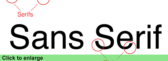
The best fonts to use are in general "Sans Serif" or have subtle edges. Text with small curved/ornate parts tend to flicker on screen.
Don't forget to stay far from thin fonts, those for sure will flicker to on screen.
The font Helvetica, often use by graphic designers, works great on video.
Also, the color should accompany the theme of the video, although a good option always is a white font with a drop shadow, this pops out nicely for readability
Note: Sans Serif means without Serifs, those tabs that hang on the points of some fonts
If you want to get more creative with lower thirds, start with adding a background image. Start simple with a solid color that is complimentary of the text. For web videos, a solid background is perfect because they're easily compressed and won't get blocky when played back. The background can extend beyond the viewable area of the screen as long as it stays on the lower third.
Note: Too many times you see crazy filled up graphics with loads of colors and what not more,
before you go completely loose always keep in mind that it is merely an extra to inform about what is happening in the video, not to take the full attention from the actual subject.
3D graphics and animation
Another great thing is using animation/motion in your lower thirds, these animations you can create inside your video editing program, or in animation software like Motion from Apple or After Effects from Adobe.
Motion is software that has a lot of good templates for you to start with, they are also editable so even with few knowledge you can get some great animation going.
If you are a FCP (Final Cut Pro) editor, it gets even easier, FCP has a content library featuring titles, transitions, effects, and generators, most of which are Smart Motion Templates. You can open any of these templates in Motion and customize them, then publish your modified template to FCP by saving it. The new template then is available for immediate use.
For everything it offers Apple's Motion is also pretty cheap, costing just $49,99
www.apple.com/finalcutpro/motion/
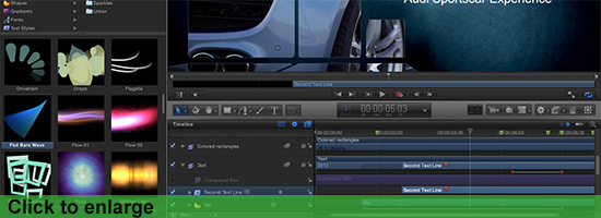
The nice thing about using these 3D animation packages is that you can be even more creative and create an extra dimension that, depending on the subject, can add an extra to the total experience.
When preparing the graphics for lower thirds you always need to keep the Safe section in mind. So what does this mean?
Well, if you would place your text to close to the sides it can be that it will be cut off on screen due to an amount of circumstances, as simple as people watching on a tv with a different format.
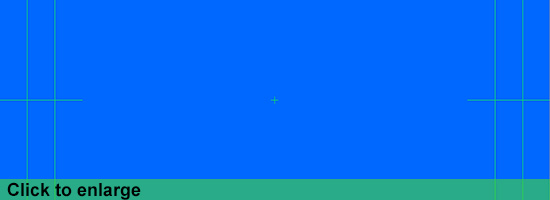
Almost every graphics program, like Photoshop, Illustrator and also Motion and AE (After Effects) have empty templates to start with. These mostly have the safe lines already in there, as you will see in the Video Tutorial.
So even without any knowledge about graphics and lower thirds it nowadays gets easier and easier to create great additions to your video production, or even webcast.
Hopefully this gives a better idea about the Lower Thirds, and feel free to aks any questions or give us your opinion about the article.
Tutorial video:
Watch more on our video's page!
Be sure to check us and Like us if you want on Facebook, follow us on Twitter and Subscribe to our YouTube channel.
Lot's of news, photo's and info for broadcasters, webcasters and mobile producers in Brazil.
by Niek van Esch
What, Why & How?
In this Insights article we are going to talk about the lower thirds, how to use them what not to do and even better, which software you can use to make them, including a short video tutorial about creating lower thirds in Adobe Photoshop.
In broadcasting, webcasting and video in general, the graphic at the bottom of the screen is called a lower third. The name suggests this graphic occupies the entire lower-third of the screen, but this is not (necessarily) the case.
Mostly lower thirds are used to identify the person speaking in the video.

Lower thirds are actually very versatile. Somehow most people relate them to News – but since they are versatile, they can be used in almost any type of video. Other uses of lower thirds include identifying the location or a time change in the story.
Now you might think, so what are exactly the 'rules' for these. Well, there are no specific rules or regulations for what a lower third should look like or what information it should contain. Instead, lower thirds should be used as support to the content of the video. When something needs to be explained, a lower third can do this without distracting the audience from the rest of the video.
When it comes to actually making these lower thirds there are some important things to keep in mind, which we will talk about now.
It may look quite simple, but they are pretty tricky things to build.
A ground-rule you can use is 'less is more'.
Often you will see "text only" graphics, even in big productions, this has a reason. Is your objective to only inform, plain text is a thing you can consider.
The best fonts to use are in general "Sans Serif" or have subtle edges. Text with small curved/ornate parts tend to flicker on screen.
Don't forget to stay far from thin fonts, those for sure will flicker to on screen.
The font Helvetica, often use by graphic designers, works great on video.
Also, the color should accompany the theme of the video, although a good option always is a white font with a drop shadow, this pops out nicely for readability
Note: Sans Serif means without Serifs, those tabs that hang on the points of some fonts

If you want to get more creative with lower thirds, start with adding a background image. Start simple with a solid color that is complimentary of the text. For web videos, a solid background is perfect because they're easily compressed and won't get blocky when played back. The background can extend beyond the viewable area of the screen as long as it stays on the lower third.
Note: Too many times you see crazy filled up graphics with loads of colors and what not more,
before you go completely loose always keep in mind that it is merely an extra to inform about what is happening in the video, not to take the full attention from the actual subject.
3D graphics and animation
Another great thing is using animation/motion in your lower thirds, these animations you can create inside your video editing program, or in animation software like Motion from Apple or After Effects from Adobe.
Motion is software that has a lot of good templates for you to start with, they are also editable so even with few knowledge you can get some great animation going.
If you are a FCP (Final Cut Pro) editor, it gets even easier, FCP has a content library featuring titles, transitions, effects, and generators, most of which are Smart Motion Templates. You can open any of these templates in Motion and customize them, then publish your modified template to FCP by saving it. The new template then is available for immediate use.
For everything it offers Apple's Motion is also pretty cheap, costing just $49,99
www.apple.com/finalcutpro/motion/

The nice thing about using these 3D animation packages is that you can be even more creative and create an extra dimension that, depending on the subject, can add an extra to the total experience.
When preparing the graphics for lower thirds you always need to keep the Safe section in mind. So what does this mean?
Well, if you would place your text to close to the sides it can be that it will be cut off on screen due to an amount of circumstances, as simple as people watching on a tv with a different format.
Almost every graphics program, like Photoshop, Illustrator and also Motion and AE (After Effects) have empty templates to start with. These mostly have the safe lines already in there, as you will see in the Video Tutorial.

So even without any knowledge about graphics and lower thirds it nowadays gets easier and easier to create great additions to your video production, or even webcast.
Hopefully this gives a better idea about the Lower Thirds, and feel free to aks any questions or give us your opinion about the article.
Tutorial video:
Watch more on our video's page!
Be sure to check us and Like us if you want on Facebook, follow us on Twitter and Subscribe to our YouTube channel.
Lot's of news, photo's and info for broadcasters, webcasters and mobile producers in Brazil.
by Niek van Esch
blog comments powered by Disqus